Before we cut to the chase, let’s take a look at the definition of “landing page” and the objectives associated with it.
What is a “landing page”?
Broadly speaking, a landing page is a page within a web page where a brand’s new product or service is promoted. It is specifically thought to nudge the user into an action that the brand considers a conversion. For instance, sharing their data through a registration form that can be later turned into a marketing contact. In summary, landing pages have the sole objective of getting one specific action.
In order to achieve this objective, a landing page must have the right structure. The design has to be such that once users get there, they execute the action that was originally intended: download an ebook, try out or subscribe to a new service, etc.
Getting there may require more than a few hours of planning and testing, so don’t be disheartened if you don’t get there right away.
Want to see how you can design the welcome page for your promotion? Explore all the possibilities and get inspired with a lookbook full of promotional design examples.
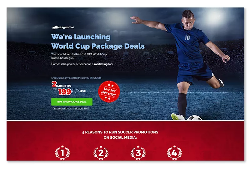
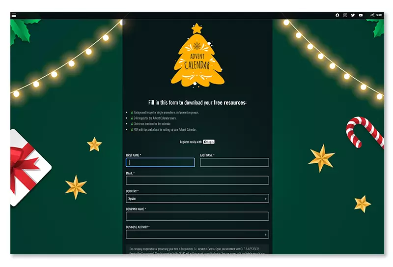
This is an example of a landing page designed by Easypromos for the FIFA World Cup. Notice the main 4 elements that make it up:
- A highlighted title that matches the background image.
- Price of the offer on a big display and in more than one line of text
- Client conversion button in a contrasting color.
- A banner featuring 4, clearly explained reasons to run football-related promotions on social networks.
The objective of this promotion was to launch an offer. Acquiring it meant saving almost €100 and unlimited promotions for the duration of the World Cup.
It is very important that instructions are clear, easy, and intuitive, and that visitors know what they have to do at all times. Otherwise, the promotion might not be successful.
Which graphic elements does a landing page have to include to make it effective?
Regardless of the field, there are some specific steps to follow when building a landing page.
A good title for the landing page
If the objective is to attract users, including an attractive title on the landing page is a must. Build a good claim that captures the attention of potential leads. A title must be short, the font has to be of a considerable size, and above all, it must be attractive. Additionally, the benefit has to be quickly identifiable.
An outstanding main image
The visual element is one of the most important to attract visitors. Whatever the offer, it must be showcased with one, or more, attractive images. They also have to transmit clearly what the offer is. This way, visitors will know what they are getting at a first glance.
Don’t use too many fonts on the landing page
For the landing age to be visually balanced, the recommendation is to use no more than two kinds of fonts to ensure a consistent style.
Some fonts that should always be avoided, such as Comic Sans, Papyrus, or Mistral. These kinds of fonts have an informal style and will make the landing page look less serious. The same goes for any other font that looks handwritten as they are usually indicated for younger audiences.
Include a good “Call to action” Un buen «Call to action»
Also known as CTA, these are brightly colored buttons or links with messages like: “Subscribe now” or “Download the ebook”. They are a fundamental element as they nudge the user towards the desired action.
Have an “Above the fold” area for relevant content
The “Above the fold” area is located on the upper part of the page once it has loaded fully. Statistics show that this is the best location to place a fill-out form, better than any other area of the page that requires the user to scroll to get to it.
It is also the area where the main title, or if necessary, an image and a short description of the offer, have to appear.
Registry form with explicit acceptance of the privacy policy
This is a key element when the main objective is to capture a lead. It is worth mentioning that the best practice is to ask the user for as little information as possible. Asking for too much information can be annoying for the user. The fewer fields the user has to fill out, the easier it is for the user, and the more chances to capture a lead. It is always possible to request more information from the user in the future. Last but not least, follow regulations regarding data protection and display the information and checkboxes for permissions, privacy, and data storage.
Visual elements of the landing page
Using different graphic elements is necessary to stay away from visual monotony and to make sure users don’t get bored and leave the landing page. Banners, images, or graphic resources that explain the purpose of the page are very useful and give the page a more fluid feeling.
Additionally, include bullet points to point out the benefits and characteristics of the product or service on offer. This will make for a more pleasant visual experience for the user.
Include testimonials
Including users’ opinions is an effective tool as it gives more credibility and makes users feel more comfortable when filling out registration forms. If possible, a picture of the user next to their opinion or review can be included with the text.
Set up a “Thank you” page after carrying out the action of the landing page.
This kind of page comes up right after a user has been turned into a lead. Thank you pages are usual, but more often than not their full potential is wasted. Use this page to show users related content that could be interesting for them.
Additional recommendations
- Get rid of distractions. Only show the most relevant information and eliminate elements that might distract users such as additional URLs. This will give the user only two options: fill out the form or leave the page.
- Think responsive. Frame the landing page to be visualized on mobile devices and tablets, a sizable portion of traffic will come from those.
But worry not, the platforms below all have the option to preview the landing page’s design on mobile devices.
Available platforms to design a landing page
Here are three examples of platforms to layout your next landing page. These are only three examples, there are plenty more available on the Internet.
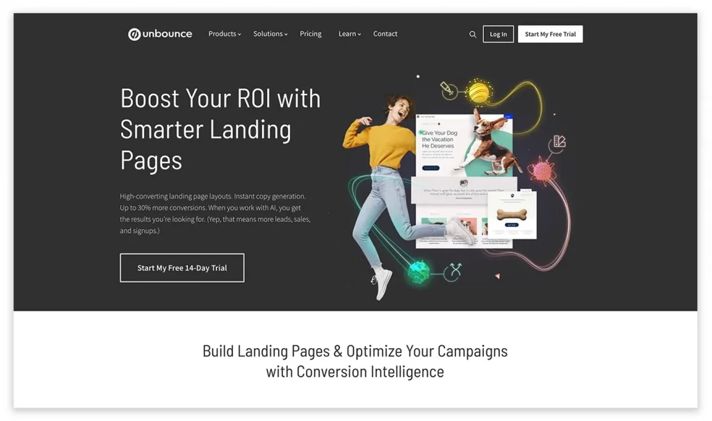
Unbounce is one of the platforms most commonly used by agencies and online shops. It is easy to use, has many available templates, and also hosts the landing page.
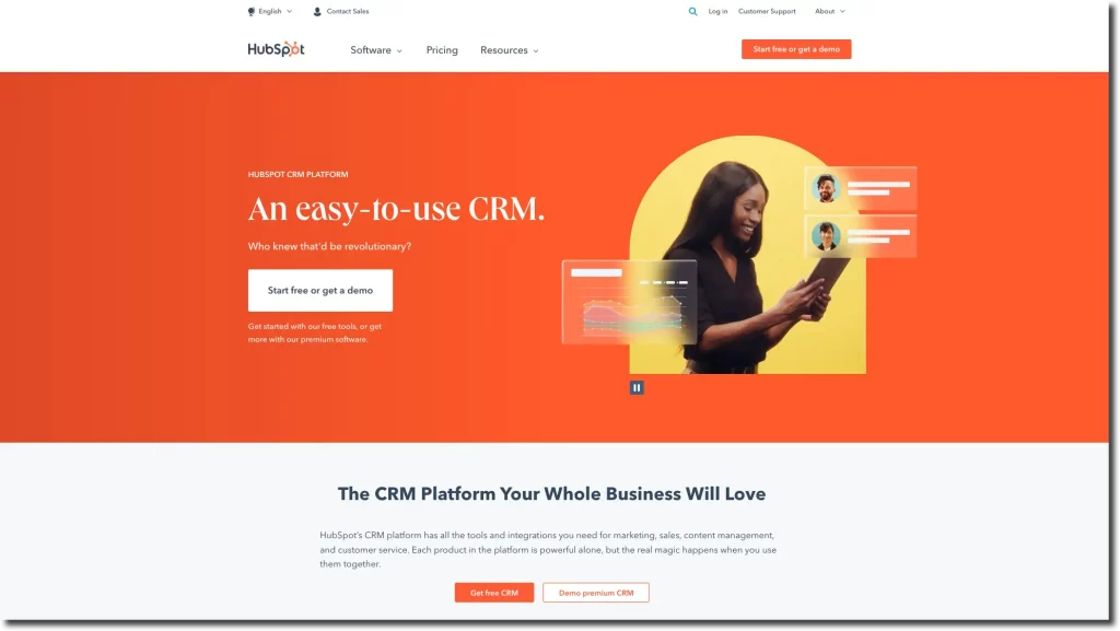
HubSpot is a marketing software suite that offers multiple possibilities for creating landing pages as well as helping drive traffic and generate leads. It also allows adapting landing pages to specific marketing campaigns and following up on them.
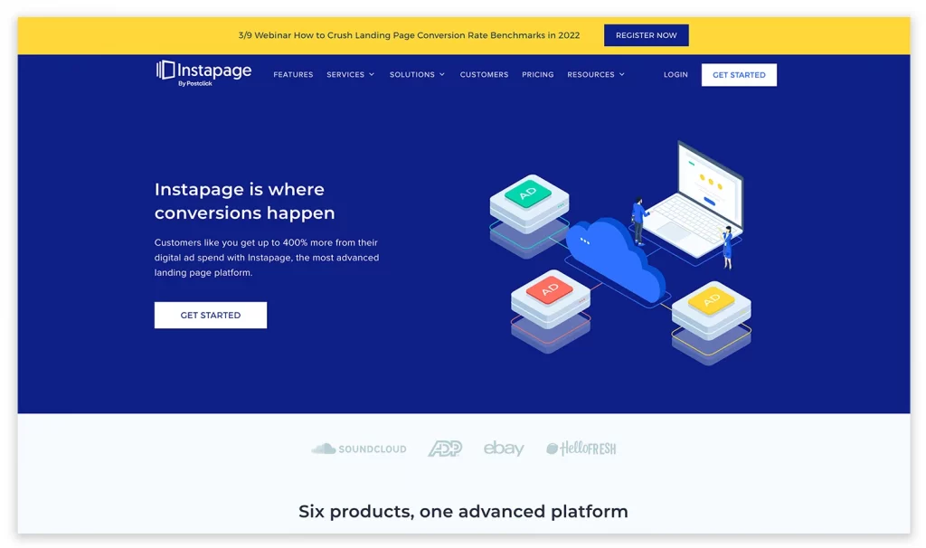
Instapage makes creating landing pages easy for any kind of user. You won’t need any external help to set up your landing page.
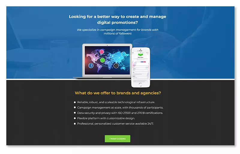
Thinking about running a contest or giveaway and need to lay out the landing age?
With Easypromos you will be able to layout a great landing page for your promotion in no time and without previous programming skills.
Your promotion’s microsite is fully customizable with your background image and corporate colors. Alternatively, you can use our ready-made templates.
Additionally, you can play around with the position, colors, and transparency of the promotion’s container where the text, images, and buttons will be displayed. And best of all, you don’t have to worry about the mobile version, our platform adapts all the content automatically. 100% responsive!
Furthermore, thanks to our widget system you can embed the landing page anywhere on your website. This way, users can participate without leaving your web page.
Finally, you can also combine an externally made landing page and configure it so that the CTA button redirects users to the registration form made with Easypromos. All you have to do is disable the welcome page in the editor. It’s that easy!
We hope you find these tips and resources useful to create your next landing page. Get down to business and start working on that promotion idea! If you have any doubt or questions, contact our customer support team via live chat, we will be happy to help!